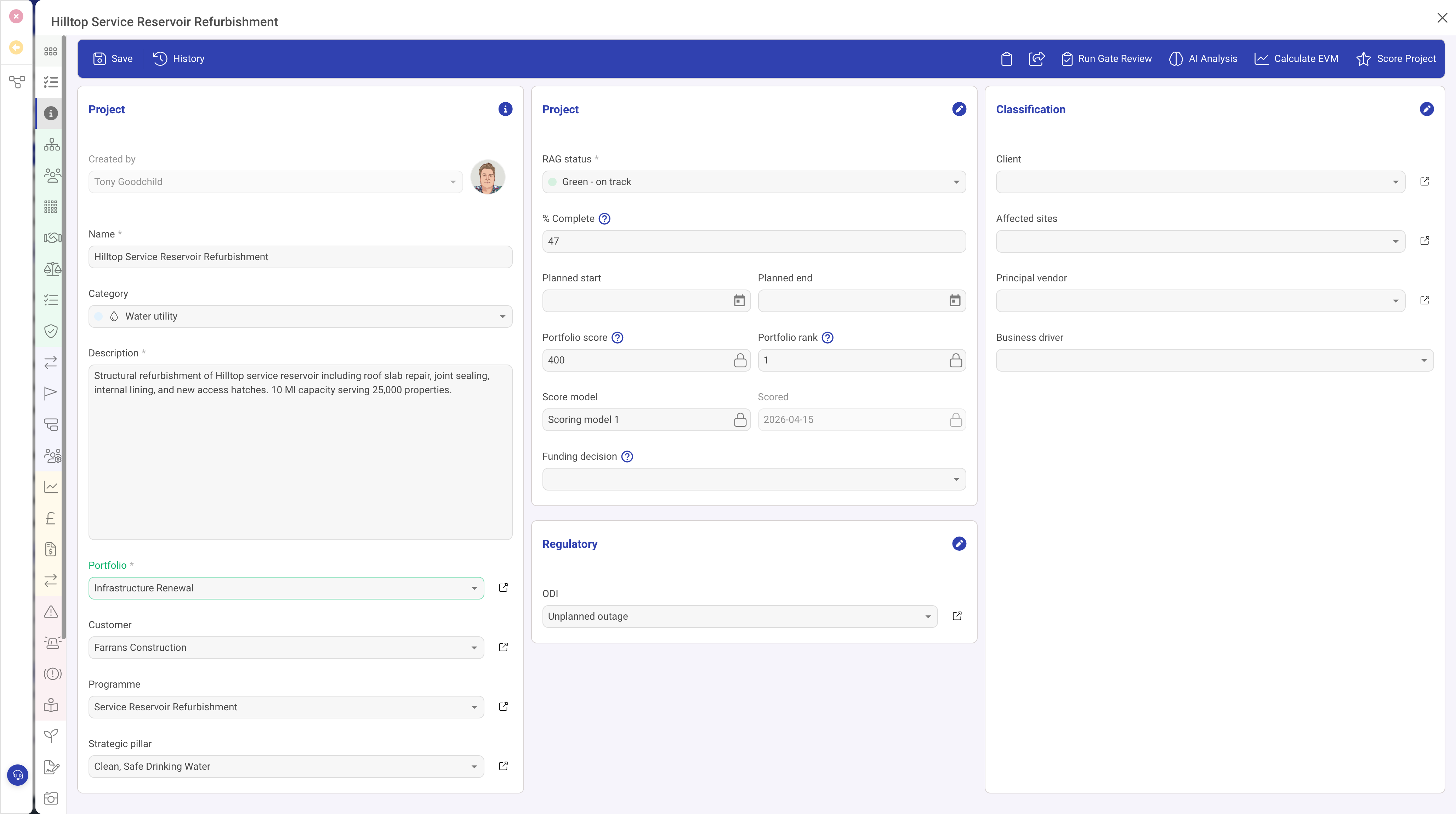
Overview
The Form row type is the most widely used row type in DemandFlow. It renders a section of data entry fields that allow users to view and edit the properties of a record. Almost every entity definition uses at least one Form row, and most use several to organise fields into logical groups.
When to Use
Use the Form row type whenever you need users to view or edit data fields on a record. This includes:
- Capturing basic record information (name, description, status, dates)
- Collecting structured data through dropdowns, checkboxes, and multi-select fields
- Displaying read-only computed values or timestamps
- Providing rich text editing areas for detailed content
- Linking to other records through lookup fields
Properties
| Property | Required | Description |
|---|---|---|
| Type | Yes | Must be set to form |
| Header | No | A heading displayed above the form section. When provided, it creates a visually distinct section with a title bar. Examples: "General Information", "Contact Details", "Financial Summary". |
| Icon | No | An icon displayed alongside the header text. If not specified, a default pen icon is used. |
| Subheader | No | Additional descriptive text displayed below the header. Use this to provide guidance or context about the form section. |
| Fields | Yes | An array of field definitions. Each field defines a single data input or display element. See the Field Types Reference for details, including Text Input, Indexed Select, Date/DateTime, User Selection, Object Lookup, and more. |
| Visibility | No | A condition that controls when this form section is shown or hidden based on another field's value. |
| Full Height | No | When enabled, the form section expands to fill available vertical space. |
Field Layout
Fields within a form section are arranged in a flowing layout. Each field has a width property expressed as a percentage (1 to 100). Fields flow left to right within the section, wrapping to a new line when the total width exceeds 100%.
Layout Examples
| Layout Goal | Field Widths |
|---|---|
| Two fields side by side | 50% + 50% |
| Three fields in a row | 33% + 34% + 33% |
| One narrow + one wide | 25% + 75% |
| Full-width field | 100% |
This percentage-based system gives you flexible control over form layout without needing to worry about exact pixel dimensions. The layout automatically adapts to different screen sizes.
Common Field Properties
While each field type has its own specific configuration, all fields share a common set of properties:
| Property | Description |
|---|---|
| ID | The field's unique identifier, which maps to the property name on the stored record |
| Type | The field type (e.g. input, date, indexedSelect). See the Field Types Reference for all options. |
| Name | The display label shown to the user |
| Width | The percentage width of the field within the form section |
| Required | When true, the record cannot be saved without providing a value for this field |
| Read Only | When true, the field displays its value but cannot be edited |
| Grid | When true, this field also appears as a column in list/grid views of the entity |
| Help | Tooltip text shown when the user hovers over the field label, providing additional guidance |
| Placeholder | Hint text displayed inside the field when it is empty |
| Default | A default value automatically assigned when a new record is created |
| Visibility | A condition that shows or hides this individual field based on another field's value |
Multiple Form Sections
A single column can contain multiple Form rows, each with its own header and set of fields. This allows you to create clearly separated sections within the same column. For example, a column might have:
- A "General Information" form section with name, status, and description fields
- A "Contact Details" form section with email, phone, and address fields
- A "Financial Summary" form section with budget, spend, and forecast fields
Each section is visually distinct with its own header, making it easy for users to find the information they need.
Available Field Types
The Form row type supports a wide range of field types, each designed for a specific kind of data. For a complete reference of all field types, including their properties and configuration options, see the individual field type articles: Text Input, Text Area, Rich Text Editor, Number, Checkbox, Date/DateTime, Indexed Select, Single/Multi Select, User Selection, Object Lookup, URL, Password, Tags, Icon Chooser, Colour Picker, Slider, Gauge, Checkbox Group, and Parent Link.