Overview
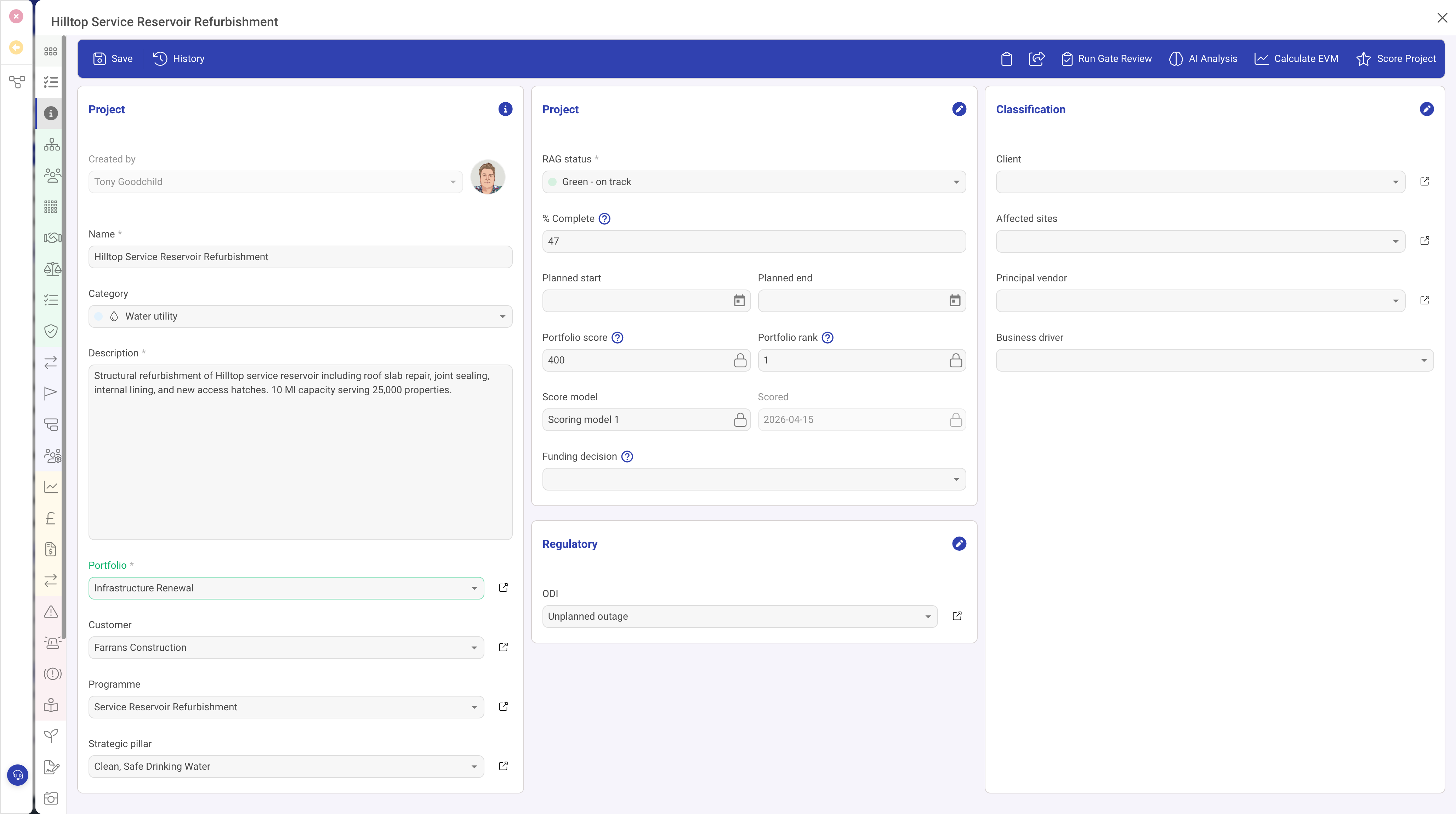
The Indexed Select field type (indexedSelect) is one of the most versatile and commonly used field types in DemandFlow. It provides a dropdown menu with a predefined list of options. Each option has a unique identifier and display text, and can optionally include a colour for visual distinction and a score value for assessment calculations.
Properties
| Property | Required | Description |
|---|---|---|
| ID | Yes | The field identifier. |
| Type | Yes | Must be set to indexedSelect |
| Name | Yes | The display label. |
| Options | Yes | An array of selectable options. Each option has an ID (stored value) and Text (displayed value). |
| Width | No | The percentage width within the form section. |
| Required | No | When true, an option must be selected. |
| Read Only | No | When true, the selected value is displayed but cannot be changed. |
| Scored | No | When true, each option includes a numeric score value. Used with the Scoring row type for assessment calculations. |
| Grid | No | When true, appears as a column in list views. |
| Grid Colour | No | When true, the option's colour is displayed in the grid view, making it easy to identify status at a glance. |
| Help | No | Tooltip text. |
| Default | No | The default option ID selected for new records. |
| Visibility | No | A condition controlling when this field is visible. |
Option Configuration
Each option in the Options array can have the following properties:
| Property | Description |
|---|---|
| ID | The value stored on the record when this option is selected. This is typically a string identifier. |
| Text | The display text shown in the dropdown menu. |
| Colour | An optional colour value (e.g. a hex code) used to visually distinguish this option in the form and grid views. |
| Score | An optional numeric score associated with this option. Only used when the Scored property is enabled on the field. |
Colour-Coded Dropdowns
When options include colour values, the selected option is displayed with its associated colour as a visual indicator. This is particularly effective for status fields where colours convey meaning at a glance:
- Green for "Completed" or "Active"
- Amber/yellow for "In Progress" or "Pending"
- Red for "Overdue" or "Critical"
- Grey for "Draft" or "Inactive"
Enable the Grid Colour property to carry these colours through to the list/grid view, allowing users to scan record statuses visually.
Scored Dropdowns
When the Scored property is enabled, each option carries a numeric score. This integrates with the Scoring row type to provide automatic assessment calculations. For example, a Risk Likelihood field might have options scored from 1 (Very Low) to 5 (Very High).
Indexed Select as a Visibility Trigger
Indexed Select fields are commonly used as visibility triggers. Other fields, rows, or panels can have visibility conditions that reference an Indexed Select field, showing or hiding content based on the selected option. This enables dynamic, context-sensitive forms.
Use Cases
- Status fields — Draft, In Progress, Complete, Archived (with colours)
- Priority levels — Low, Medium, High, Critical (with colours and scores)
- Categories — classifying records into predefined types
- Yes/No/NA — simple tri-state selections with optional scoring
- Risk ratings — scored options for risk assessment calculations
Best Practices
- Keep option lists to a manageable size (typically 3 to 10 options)
- Use meaningful colours that are consistent across your entity types (e.g. always use the same shade of green for "Active")
- Enable Grid and Grid Colour for status fields so they are visible and colour-coded in list views
- For very long option lists, consider using an Object Lookup instead, which allows searching and filtering