Overview
Every entity definition in DemandFlow follows a consistent structural hierarchy that determines how a record is presented to the user. This article explains each level of that hierarchy in detail, helping you understand how to read and configure entity layouts.
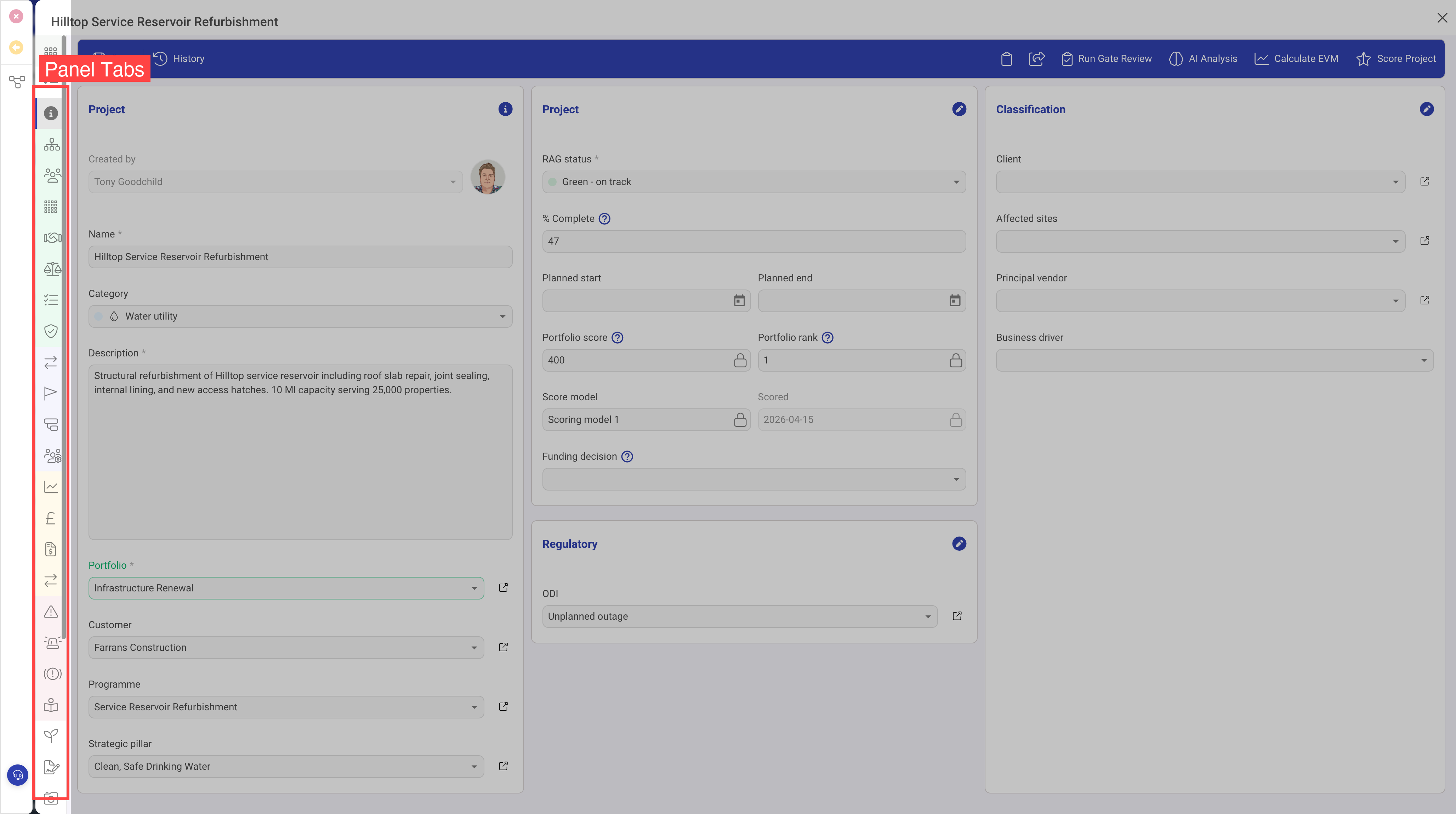
Panels (Tabs)
Panels are the outermost structural element of a record's layout. Each panel renders as an icon tab along the left side of the record editor. When a user clicks a tab, the corresponding panel's content is displayed.
Panel Properties
| Property | Required | Description |
|---|---|---|
| Panel Name | Yes | The text displayed on the tab tooltip. Keep this concise — typically one or two words. |
| Panel Icon | Yes | The icon displayed on the tab button. Uses the Font Awesome icon library. |
| CSS | No | An optional style class. Use sidebarBackgroundGrey to give the panel a subtle grey background, which works well for panels containing dashboards or read-only content. |
| Hidden | No | When set to true, the panel is hidden by default. It can still be shown programmatically or via visibility conditions. |
| Visibility | No | A condition that controls when the panel appears. See the Visibility Conditions section below. |
Best Practices for Panels
- Place the most commonly used information in the first panel (typically named "General" or "Overview")
- Group related content together — for example, all financial data on a "Finance" panel, all documents on a "Documents" panel
- Use visibility conditions to hide panels that are only relevant in certain states (e.g. a "Resolution" panel that only appears when a ticket is closed)
- Limit the number of panels to avoid overwhelming users — typically 4 to 7 panels works well
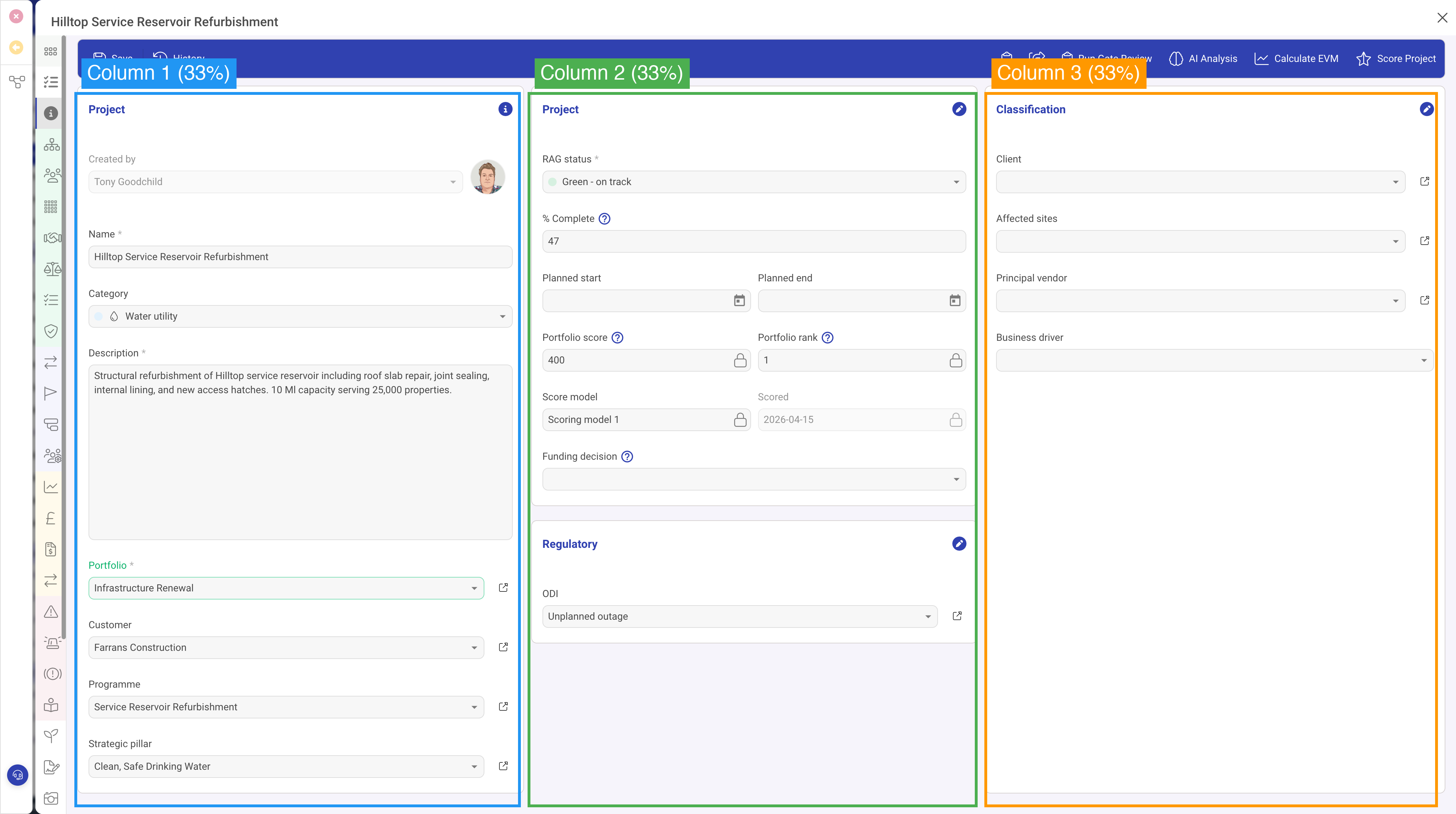
Columns
Each panel contains one or more columns that divide the panel's width horizontally. Columns are defined in the panel's Panel Columns array.
Column Properties
| Property | Required | Description |
|---|---|---|
| Width | Yes | The percentage width of this column. All column widths within a panel should add up to 100. |
| Rows | Yes | An array of row definitions that stack vertically within this column. |
Common Column Layouts
| Layout | Column Widths | Best For |
|---|---|---|
| Single column | 100% | Dashboards, wide grids, activity feeds, document lists |
| Two equal columns | 50% / 50% | Side-by-side form sections with balanced content |
| Sidebar + main | 33% / 67% | Key details in a narrow sidebar with detail content alongside |
| Three columns | 33% / 34% / 33% | Dense information displays where many fields need to be visible |
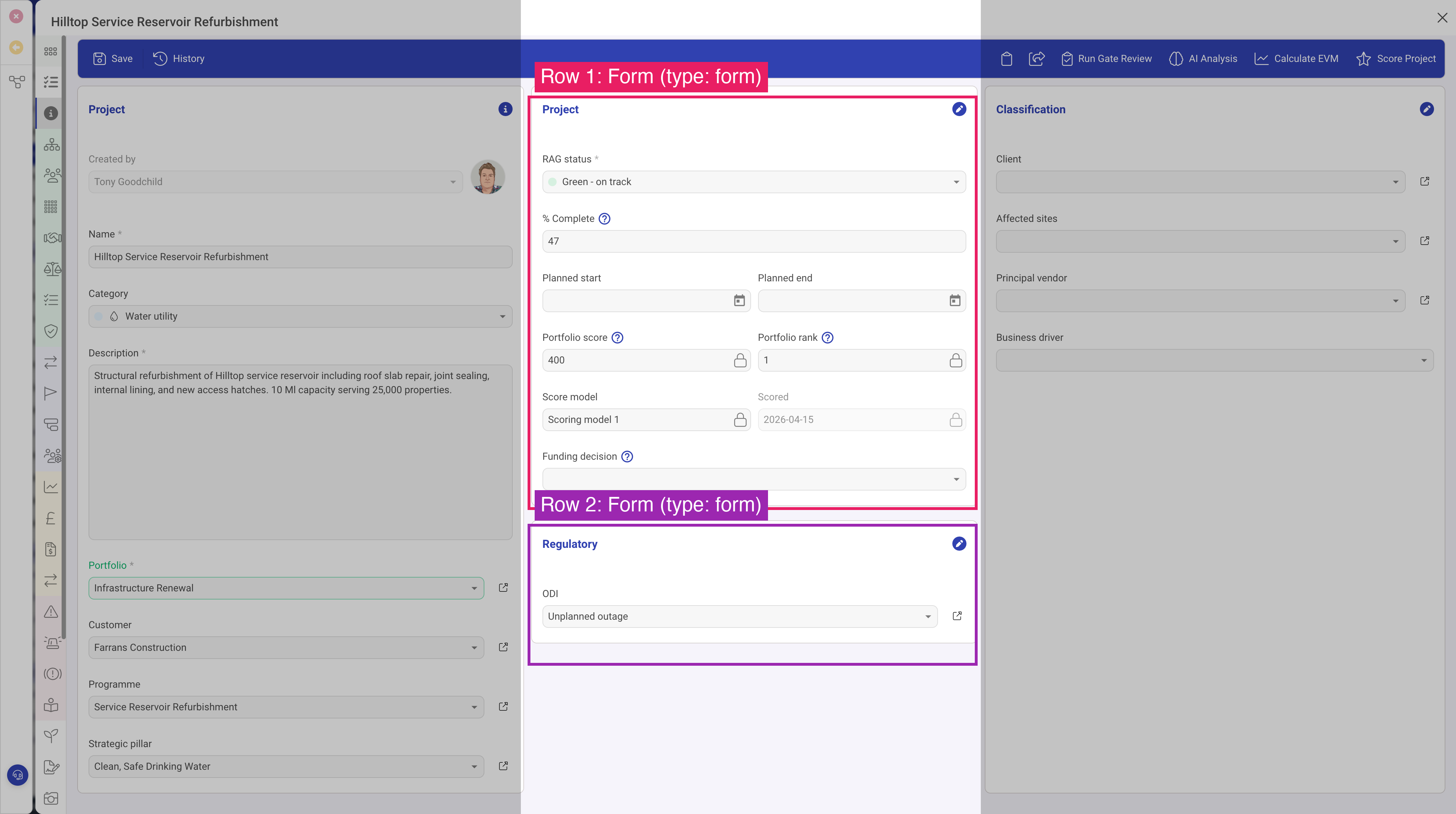
Rows
Rows are the content blocks within a column. Each row has a type property that determines what kind of content it renders. This is the most important configuration property — it controls whether the row shows a form, a grid of related records, a file upload area, a map, a dashboard, or any other supported content type.
Common Row Properties
While each row type has its own specific properties, several properties are shared across most row types:
| Property | Description |
|---|---|
| Type | The row type identifier. Determines what content this row displays. See the Row Types Reference for all available types, starting with Row Type: Form. |
| Header | A section heading displayed above the row's content. Most row types support this property. |
| Icon | An icon shown alongside the header text. |
| Visibility | A condition controlling when this row is shown or hidden. |
| Full Height | When enabled, the row expands to fill the remaining vertical space in the column. Useful for grids and dashboards that should use all available screen space. |
| Min Height | A minimum height in pixels for the row's content area. Prevents content from collapsing too small. |
Visibility Conditions
Visibility conditions are a powerful feature that can be applied to panels, rows, and even individual fields. A visibility condition watches the value of another field on the same record and shows or hides the element accordingly.
How Visibility Conditions Work
A visibility condition has two parts:
- Field ID — the identifier of the field whose value determines visibility
- Value — the value that the field must have for the element to be visible
When the specified field matches the specified value, the element is shown. When it does not match, the element is hidden.
Example
Suppose you have a Status field with options "Open", "In Progress", and "Closed". You could configure a "Resolution Details" form section with a visibility condition that references the Status field with a value of "Closed". This section would only appear when the user sets the status to Closed, keeping the form clean and focused at other times.
Visibility conditions update in real time as the user changes field values, providing an interactive and dynamic form experience.
Putting It All Together
Here is how the hierarchy comes together for a typical entity:
- The user opens a record and sees panel tabs along the left side
- The active panel shows one or more columns side by side
- Each column contains rows stacked vertically, each showing different types of content
- Form rows contain fields where users can view and edit data
This layered approach gives you fine-grained control over the user experience while keeping the configuration structured and maintainable.